Twitter for Android has been going through a bit of an identity crisis or, more specifically, an identity makeover.
A recent beta version of the app gave the app a sliding menu drawer, but it turned out to be redundant with the categories that scrolled horizontally along the top of the feed.
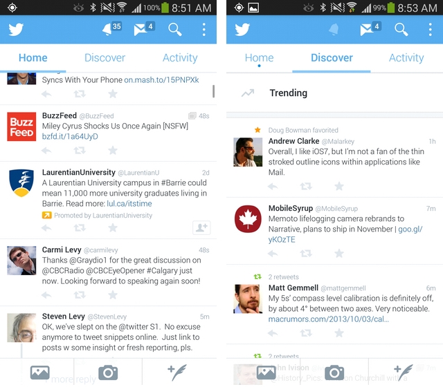
Now, Twitter has done away with that sliding drawer in favour of a seemingly-simpler top menu layout, reworking the notifications and DM menus into icons. Now, users can slide between Home, Discover and Activity, with a bell denoting notifications and an envelope for direct messages. Search and the renewed menu button have not changed.
Towards the bottom of the app, a translucent quill, denoting the Tweet button, now lives on the bottom right, along with quick access to the camera and gallery. This takes up too much space, in my opinion, especially on devices with smaller screens and lower resolutions, but we’ll see if Twitter keeps it permanently.
This is the second major design overhaul in as many weeks, so it’s likely we’re in the middle of a vetting process.
To sign up for the Twitter for Android beta, head over to Google Groups and join the program.
What do you think of the new layout?
[source]Google Play[/source]
MobileSyrup may earn a commission from purchases made via our links, which helps fund the journalism we provide free on our website. These links do not influence our editorial content. Support us here.
