Let’s start from the beginning.
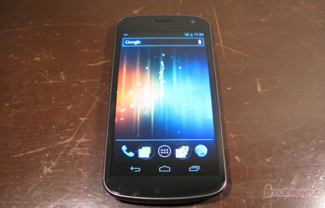
Take the phone out of your pocket. It’s clean, black, unassuming. A soft white LED pulses at you. You grip the phone firmly in your right hand — it is comfortable, secure. Slide your thumb to the power button, its tension satisfying, just the right amount of feedback. The black screen alights, a crisp image of a city at dusk stares back at you, makes you long for a room with a view. Text is like ink on paper, in a font you’ve seen somewhere before but different, new. You unlock, a comforting fade to black as a home screen appears: icons floating in air, a small analog clock ticking away.
This is Android. More so, this is function. No more scraping for context — where is the menu? why does the back button exit the app? why is everything so hard? — this is consistency.
Welcome to Ice Cream Sandwich. Have a taste.
(Check out Part One of our review for an in-depth hardware overview. Part Two covers mainly the Ice Cream Sandwich software)
Performance
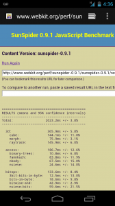
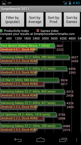
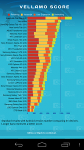
As we teased in Part 1, the Galaxy Nexus is a beast. Despite having some 40% more pixels to process, it holds up extremely well in most of the real-world and synthetic benchmarks we use in our suite. More importantly the device feels faster than perhaps any other Android phone on the market. The real test will be if and when Samsung brings its Exynos processor to a Galaxy device with a 720p screen.
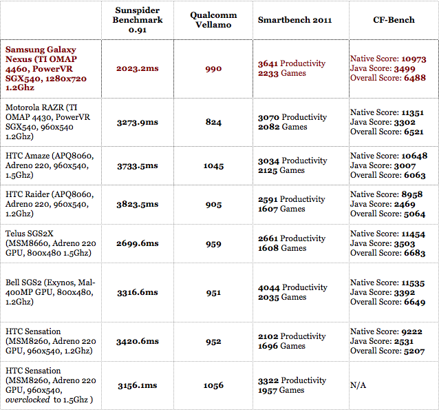
We’d say the experience of moving from Gingerbread to Ice Cream Sandwich is comparable to how much faster the Nexus One felt moving from Eclair to Froyo (2.1 to 2.2). When you take a look at the benchmark results, keep in mind that for any graphical test the Galaxy Nexus is running at its native 1280×720 resolution; the GPU is pushing some 40% more pixels than a qHD display, so it’s not an apples-to-apples comparison. That being said, the device holds up extremely well — superbly even — given the circumstances. The one non-graphical benchmark, Sunspider Javacript test, scores higher than any other device to date, including the venerable Bell Galaxy S II.
The Home Screen
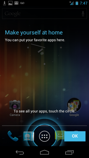
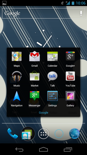
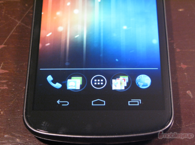
Google has wisely kept things fairly unchanged from Gingerbread, except in the areas that count. There is a permanent four-icon dock at the bottom of the screen, two icons on either side of the new app drawer. The dock is customizable, fluid; you can put individual apps or folders on it, or leave it blank. Mimicking iOS it is possible to create a folder by dragging an icon atop another, though in many ways we prefer this implementation. Once a folder is created, it doesn’t open and force you to interact with it; you can leave it unnamed if you wish as Google doesn’t presume to know what you’re thinking.
When moving an app or widget around the screen, a subtle grid appears, showing you the allowable space. Much of the aesthetic has been taken from Honeycomb; certain widgets are now resizable, according to whether they adhere to the new Ice Cream Sandwich APIs.
One of the more contentious changes made in ICS is the permanent Google Search bar that floats below the notification area. Supplanting an optional search widget from previous Android versions, the bar serves as both local and web-based search. You can choose what local content to index, but we found that at its default setting (which indexes apps, contacts, bookmarks and music, among others) results were almost instantaneous. We suppose you could put a Bing or Yahoo widget below it if you really wanted to, but we really got used to using the bar as a Google Instant replacement. It also supports the new instant voice transcription feature which we use in the car all the time: “Call Dad home” for example.
The notification area has been tweaked to allow for swiping away seen or unwanted messages. In fact much of the OS has been overhauled for gesture and swipe support — we’ll see this later in Gmail and Calendar, among others.
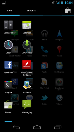
Once in the app drawer, you can hold down an app to bring it to one of the home screens, or drag atop to uninstall. This is a feature we graciously used in ADW Launcher, and are pleased it made its way into ICS. (We have to note that the notification swipe-to-disappear debuted in CyanogenMOD 7 — Google owes a lot to the open-source modding community for some of ICS’ best features). Widgets, instead of holding down on the home screen, are now accessible in a separate tab of the app drawer. This allows for a larger area in which to seek out the appropriate choice, but can get cluttered and frustrating having to swipe horizontally page after page to find the right one.
We love the new look of the home screen, and although it is not a drastic overhaul in functionality, we believe most of the changes are for the better. While we’d like to see an option to scroll vertically through the list of apps, we understand Google wanting to adhere to consistent swipe-based navigation throughout the OS.
First-party apps
As we showed you in our short hands-on video, Gmail, Calendar, Contacts (now known as People) and a few other first-party apps have received upgrades. The simple description would be that each has been modified to support swipe gestures and pinch-to-zoom (though for some reason Gmail still does not support pinch-to-zoom in the email body) but that’s too simple.
Gmail looks fantastic, with a minimalist interface that opens up only if you want it to: most of the more advanced options are hidden in the multiple deep context menus, but the majority are within one-touch reach. You have complete control over your labels and the new Priority Inbox, and the sender has a dedicated blue banner just above the message that links up with the People app.
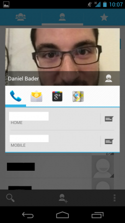
People is the new Contacts and brings a magazine-like aesthetic to the interface. Google wants your friends to be presented in big, bold photos and easy to read text. You can swipe between views (you even have your Google+ circles in the Groups tab) and your favourites are presented as large photos pulled down from their Google account.
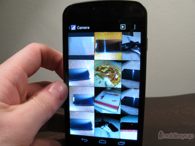
Calendar now supports pinch-to-zoom to expand or contract the selected view, though it doesn’t switch between day/week/month automatically. The Gallery app has thankfully eschewed its accelerometer-sensitive 3D proclivities in favour of a more touch- and swipe-friendly horizontal overview. You can edit photos directly from the app with built-in filters (hello, Lomo), auto-fix, crop, rotate et al. This is really a full-blown editing solution, though it won’t replace your copy of Picasa.
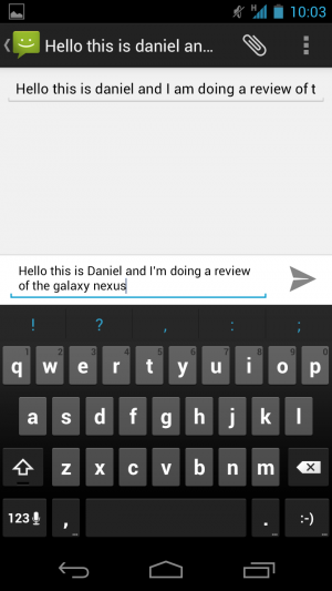
Messaging and Email have received aesthetic overhauls, too, and support the new instant transcription feature present on the greatly improved keyboard. Seriously, this keyboard is amazing. We won’t claim the third-party keyboard market dead, but it’s certainly no longer necessary, and that’s good news.
Camera
The camera interface, like the gallery app, has been completely redone, though Google insists on using a shade of grey on the right-hand bar that should be relegated to wool dress pants. Nevertheless, most options can be enabled or disabled with two touches, though we wish it took less time to enable or disable the flash. This has been a point of contention for us that only HTC seems to understand: instead of having three separate buttons for Auto/Flash/No Flash, have a permanent icon on the settings bar that cycles through the options.
The quality of the sensor depends completely on the available light; unlike the iPhone 4S or HTC Amaze the Galaxy Nexus does not perform well in poor lighting conditions. Outside in the sun we were able to take beautiful, dynamic shots that focused quickly and accurately; indoors, or in shadow, the lens seemed to have trouble focusing on a foreground subject, often resulting in the whole image being blurry.
The sensor seemed to adjust to changes in the environment very well, seemingly the result of a well-tuned white balance algorithm. Autofocus generally excels, though the aperture doesn’t appear to be high enough to achieve true depth of field. ICS also includes a cool face detection feature that automatically adjusts exposure according to the foreground subject (and allows for real-time face morphing in videos). You can touch the screen to focus at any time, and when you’re done taking photos there are a number of filters and settings to play with, adding up to a powerful still shot experience.
Ultimately, though, Samsung and Google made too high an image quality sacrifice in order to achieve an instant shutter. While 90% of photos turn out great, it’s the blurry 10 percent that ruin the fun for everyone. The shutter is indeed instant, so you may be able to take that candid action shot your other phone wouldn’t have been able to. It’s a tough trade-off, and will be the obvious choice for most people.
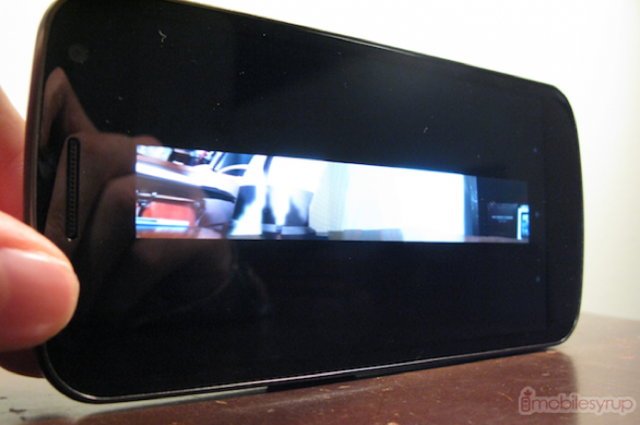
Google has implemented a very cool and usable Panorama feature. We enjoyed being able to pan across a room and have the phone do the work of keeping us steady and straight. It may be a little-used feature but it shows off how powerful the processor is in the Galaxy Nexus: results were available in seconds.
Video looks good at 1080p, though overall quality doesn’t remind us enough of the excellent sensor from the Galaxy S II family. There is a noticeable softness to what is captured, though frame rates maintained fluid even in difficult conditions. Our main issue with the end product, however, was not the quality but the smoothness. If you look at the video sample above you can see that while the sensor handles light changes with aplomb there is a noticeable shakiness to the camera movement that the Galaxy S II was able to overcome. And while continuous autofocus is a fantastic feature to have, it created a woozy judder to a simple outdoor scene.
Overall the camera experience is much better than the camera quality on the Galaxy Nexus. While most of the photos and video exhibited ample detail and accurate colour we can’t wait until other OEMs integrate their higher-quality sensors into the existing ICS architecture.
Keyboard & Typography
We feel like this deserves its own section for a couple reasons. First, because Gingerbread’s keyboard was terrible, and second, because Google finally got it right.
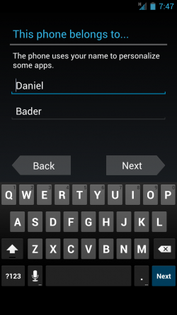
Let us put it another way: the delta between the Gingerbread keyboard and this one is enormous — entire cities could fall into the gap. Even though they share more than a close resemblance, we can trust the ICS keyboard in a way that was never possible before. Not only is autocorrect good but it’s smart. Any word that the software is confident enough to change is underlined in a light grey: you can always tap on it to change back to the original. If deemed misspelled, a word is underlined in red and will bring up a list of alternatives.
Perhaps a combination of a stellar touchscreen digitizer and software optimization but this is the first time we can confidently just type without checking every few words for the inevitable double-letter or, worse, a missed space. Gingerbread was notorious for inserting the first letter of a word twice, and even more for missing spaces. Nor did we notice any slowdown, another common trait of the Gingerbread keyboard: however fast we typed our presses were picked up.
Dictation has been improved and localized, meaning it is no longer necessary to be connected to the internet to speak a note to your phone. Transcription is almost instantaneous, too, and only seldom got the input wrong. The worst offenders were words like ‘Nexus’ which got turned in ‘Texas’, but generally we were pleased with the results, especially for the speed.
Google has changed up the traditional Droid font in ICS, opting to create their own dubbed Roboto. While it adheres pretty closely to Helvetica and a few san serif iterations, it is a pleasure to read on the Galaxy Nexus’ crisp 720p screen and a drastic improvement over previous Android versions. Read more about Roboto on Google+.
Browser
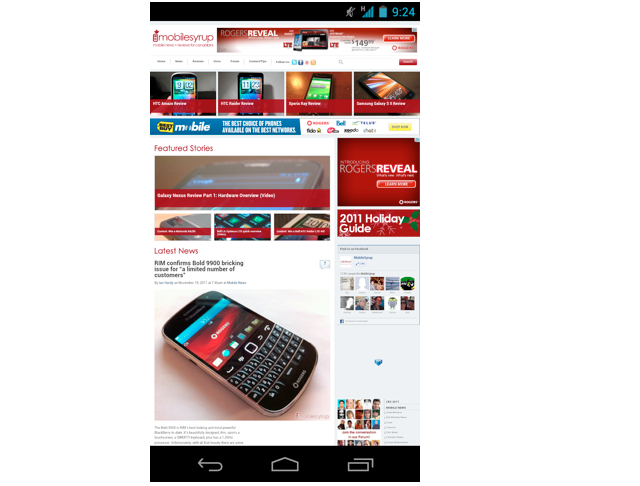
In a word, blazing. Not only can you request the desktop version of a web page, but when loaded those desktop pages scroll like the wind. Pinching to zoom is effortless, though we noticed the occasional stutter when loading a graphics-intensive page. Thankfully the ICS browser can sync with your Google account for bookmarks, and all the settings are located conveniently on the top right corner Action Bar.
One thing we noticed was that, occasionally, the request desktop feature would not work, relegating us to a lifetime of mobile simplicity. We also found no apparent way of getting into the Downloads app from the browser itself — if you accidentally remove the Download Compete notification you have to exit the browser and open the Downloads app separately. The tabs menu, like the new multitasking paradigm, utilizes big static pictures of a web page which can be swiped to the left to dismiss. It’s these small functional flourishes that help cement a consistent and enjoyable user experience throughout ICS.
In terms of overall performance, we achieve a ridiculously fast 2023.2ms result on the Sunspider Javascript benchmark. HTML5Test.com scores a 230+3, some 50 points better than the stock Gingerbread browser. Unfortunately ICS does not comply quite as well as Mobile Safari in iOS5: our iPhone 4S achieved a 296+9.
This is clearly the Honeycomb browser ported to phones, as the Labs feature with its awesome Quick Controls is present. This hides by default the address and top action bars, which are then activated by sliding your finger from either the left or right side of the screen. This was one of our favourite features of the Honeycomb browser, and we’re thankful for its presence here.
Diving Deep & Tidbits
There is a lot more going on in ICS under the new veneer and updated apps. It’s a fundamental change in how we interact with our Android phone. Here are a few snippets of some of the more miscellaneous improvements.
– Google has implemented per-app data administration to prevent specific programs from using too much bandwidth. It’s nice to know that you can natively restrict a data-hungry app’s ability to max out your monthly allotment. For example, due to Google+’s auto photo upload feature, it used 104MB of data in less than two hours. Many apps, like the browser, have their own bandwidth management settings, bringing a level of granularity to an OS that was notorious for errant background bandwidth usage.
– Google has also included a number of APIs to aide developers make more beautiful, functional apps. While few third-party apps have been updated to take advantage of ICS’ features, we’re excited to see many of the swipe-and-gesture elements implemented into phone apps.
– We must talk about the fact that SD card storage is now available to apps, meaning that OEMs no longer need to set aside a portion of the internal memory for app storage. This is also brought over from Honeycomb, and essentially eliminates the issue of low app storage space.
– Android 4.0 introduces Android Beam, the NFC-enabled API that allows two ICS-powered devices to touch, back-to-back, and share content. While we haven’t had a chance to test it out, the possibilities are pretty much endless as Google has opened up the API to third-party developers. Also present is WiFi-Direct, which allows two devices connected to the same SSID to share content directly without explicit routing paths. We first saw this on the Galaxy S II and are pleased it’s been brought over natively to ICS.
– Because there is no longer a dedicated menu button, it is not possible to access the Settings app with that method any longer. Instead, swipe down the notification bar and there is a small icon that quickly enters the Settings.
– Visual voicemail is now standard within the People app, so if your carrier supports it and you subscribe to it a transcription of that person’s message is available.
– If you get a phone call and want to ignore it without being too impolite, swiping upwards reveals a list of pre-canned text messages that can automatically be sent to the despondent respondent.
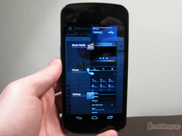
– To kill an app, open the multitasking menu and swipe it away. The gesture kills the process. You can also do this for tabs in the browser, though only a left-hand swipe works in that case.
– There is no explicit USB Mass Storage Mode in ICS (or, at least, on the Galaxy Nexus). Instead there is a Media Transfer Protocol (MTP) and a Camera Transfer Protocol (PTP). This allows for greater compatibility across systems, but is ultimately much less flexible than a generic Mass Storage Mode. You also, by default, don’t have access to the SD card contents (which is likely why apps are allowed to share the same partition as SD storage).
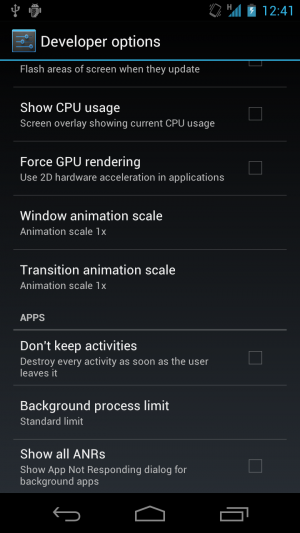
– There is a special Developer Options section on the Galaxy Nexus that allows you to enable debugging features such as Show FPS and, for apps, Don’t Keep Activities which explicitly kills an app process whenever the app leaves the foreground. You can also limit the number of background processes to 1, 2, 3, 4 or none.
– The Music and Video apps have been separated, allowing for easy consolidation of your Google purchases from the Marketplace. Though Canadians do not have access to the new Music Store, we are able to rent movies which will be stored in the Videos app. The music player has received a nice boost in functionality, too.
– Finally, Google have taken the Movie Studio app from Honeycomb and shrunk it down for phones. While it is fairly simplistic, we achieved good results piecing and editing brief video clips for home use. Unfortunately the Galaxy Nexus does not have an HDMI-out for HDTV mirroring.
Battery Life, Redux
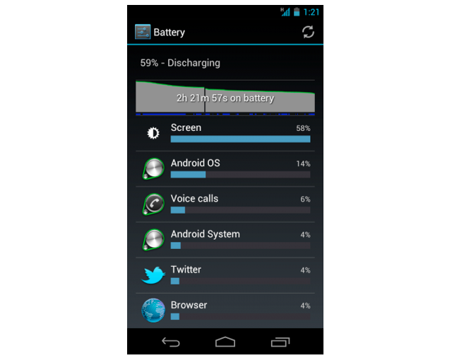
We hate to admit to being wrong, but perhaps we were a little bit hasty heaping praise on the Galaxy Nexus’ battery life. While not bad per se, it by no means impressed us. After 9 hours of admittedly thorough use we were left with 19% of the 1750mAh battery remaining.
While it is possible to prevent background data from eating up too much battery, we suspect that anyone looking for the Galaxy Nexus and ICS to dramatically change their perception on Android’s traditionally poor battery life will be sorely disappointed. We understand that three days is not ample time to judge a phone battery long-term, so we’ll monitor it over the coming weeks and report back.
Further issues
After using the Galaxy Nexus and Ice Cream Sandwich non-stop for a couple days we can safely say there are some problems that need to be resolved.
First, on the phone itself. We found that noise cancellation, depending on the type of ambient noise, is not cut as much as on, say, the Motorola RAZR. While wind seems to be at the right frequency for the algorithm to suppress much of the ‘whoosh’, walking around a mall with its more varied din of screaming children and hushed talking caused our friend to ask whether we were sitting next to a loud family.
We also found maximum call volume to be low — equal to the Galaxy S II line, which we also faulted for the same thing — and we found it hard to hear the person on the other end of the call in certain circumstances. The same thing can be said for the speaker which, paired with a default ringtone that would put a symphony orchestra to sleep, caused us to miss several important calls throughout the day. By default call vibration is turned off, so that’s something you will need to set manually in the settings.
Auto-brightness is a little too sensitive for our tastes. While we understand the need to save battery life at times we could barely read what was on the screen.
We continue to have issues with the Android Marketplace. While we like the new design the software itself is flaky, prone to crashes and unresponsiveness. Occasionally when downloading an app it will not proceed past the initial “Downloading” prompt, forcing us to exit the app and start again. We saw this on previous versions of Android, but it is high time Google fixes whatever outstanding bugs remain; apps are the gateway to user adoption.
Of course the Galaxy Nexus is going to have an extremely lively developer community — it’s the name of the game. Being an unlocked pentaband device brings it into a whole new market, one that need not trouble itself with contracts and subsidies.
The CyanogenMOD team has recently announced it has begun work on CM9, the follow-up to CM7 (they’re skipping 8 because Honeycomb was not open sourced) and for anyone who wants to dip his or her feet into the community, XDA-Developers already has a lively forum for the Galaxy Nexus.
The Upgrade Dilemma
Let’s break this down into three groups: those who already have a developer phone such as the Nexus One or Nexus S, those who already have Android devices less than, say 18 months old, and finally those who don’t have an Android device or have one pre-2010.
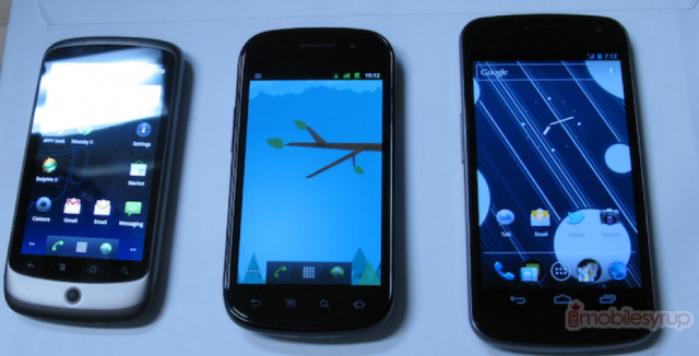
To the first group: by all means upgrade your device as this is Google’s new testing platform. Nexus One users should note that they will never officially get upgraded to ICS, while Nexus S owners should begin receiving the OTA update in the coming weeks. Though significantly sleeker, faster and more capable than the Nexus S, the Galaxy Nexus is not a home run and, considering its predecessor was released just under a year ago we wouldn’t push you to upgrade unless you’re dying for that 720p screen. With the ICS upgrade the Nexus S should get the majority of hardware-accelerated software enhancements that are present on the Galaxy Nexus, and a speed boost as a result.
To the second group: ask yourself why you would want to break a contract for the Galaxy Nexus. Is it the fastest phone on the market? No. Does it have the best camera? Nope. The best build quality? Uh-uh. What is currently has is a piece of software that, unless you’re using a cheap Asian knockoff, your device will eventually get in some form. HTC, Samsung and Sony Ericsson have already committed to updating their latest fleet of devices to ICS in 2012; whether that means in two months or twelve months remains to be seen, but you will get it. Unless you are particularly unhappy with your device, or again, looking for that gorgeous screen upgrade, hold onto your device.
To the third group: buy the Galaxy Nexus. You won’t regret it.
Final Thoughts
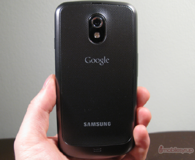
The Galaxy Nexus is the best Android device ever because it’s the best all-round Android phone. Not only is the design almost flawless but the screen is sharp, the camera capable and the software a huge leap forward. Considering it will have a software lead of at least three to four months on any new device being released with ICS, for many people it is reason enough to upgrade. Ice Cream Sandwich is the biggest leap in smartphone operating systems since perhaps iOS 2 to iOS 3 (or maybe iOS 4 to iOS 5, we can’t decide) but it fundamentally alters the way Android users interact with their phones.
Gone are the hardware-dependent capacitive touch buttons. Out are the design inconsistencies, ugly context menus and frustrating, stuttering performance. Google has proven that without embossing the Galaxy Nexus with the fastest everything it can easily compete, both in performance and enjoyment, with any device currently on the market. The Galaxy Nexus is fast because the hardware and software were designed to complement one another. We believe that it competes with, and bests, iOS 5 in many areas, though it cannot quite pull out the flawless victory card just yet. There are some lingering hardware and software issues that mar an otherwise perfect experience.
Be that as it may, Android will never be the same, and we’re so, so happy to be saying that.
Hardware Rating: 9/10
Pros:
– Stunning 720p screen makes graphics, text and media a pleasure
– Excellent performance throughout the OS
– Very good still camera quality, instant shutter a real boon to candid photography
– Build quality greatly improved over previous Samsung devices
– Design is perfect marriage between Galaxy S II and Nexus S
– Excellent sound quality from earpiece and headphone jack
Cons:
– Earpiece and speaker volume very low
– Video produces soft results; stills often out of focus
– Low-light shots quite grainy
– Battery cover quite thin and flimsy
– Disappointing battery life
– Lack of LTE will disappoint some users
– Auto-brightness too sensitive
Software Rating: 9.5/10
Pros:
– Incredible new design changes everything about Android
– First-party app improvements dramatically increase productivity
– New camera software makes Android photography fun
– Honeycomb features like re-sizable widgets and virtual many buttons implemented well
– Noticeable performance improvement in apps, games and general UI throughout OS
– Lock screen features legitimately useful
– New APIs such as People and Android Beam open doors to third-party devs
– Browser much faster than previous versions
– Unique style complemented by Roboto font
– Multitasking dramatically improved
– Data usage caps a potential money-saver
– Many more subtle changes, mostly for the better
Cons:
– Still buggy in places
– Overall “smoothness” can’t quite match iOS (though smoothness is highly subjective)
– Android Marketplace still unreliable
– App drawer cannot be set vertically
– Permanent Google search bar should be removable
—
If there are any questions or comments, or requests for future articles please email me at daniel [at] mobilesyrup.com or find me on Twitter @journeydan
MobileSyrup may earn a commission from purchases made via our links, which helps fund the journalism we provide free on our website. These links do not influence our editorial content. Support us here.

