We Canadians have always been shy on mobile stats. Usually a company communicates some carrier or manufacturer market share percentage months after they truly matter, essentially making them outdated. However, any little bit helps and gives an insight into where mobile is in Canada. According to the CWTA (Canadian Wireless Telecommunications Association) there’s over 30 million Canadians that have a mobile phone.
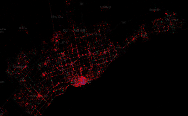
An interesting interactive map has found its way online. Eric Gundersen, CEO of MapBox, has been tracking tweets since September 2011 and so far there’s been over 3 billion. Specifically when it comes to mobile devices, Gunderson’s used several datapoints and pinpointed the number down to over 280 million Tweets.
Of course, this is throughout the world and is only data from the official Twitter app. The most prominent mobile device are the iPhone, followed by Android, BlackBerry and “other,” which is most likely Windows Phone. iPhones are in red, Android devices are green, BlackBerry smartphones are shows in purple, and everything else is a luscious pink. According to the report, “The patterns of usage in each city often reflect economic stratification. For example iPhones, in red, are predominantly in wealthy sections of the city while Android phones, in green, have more coverage in poorer sections.”
Specific country numbers are not listed, but zoning in on Canada – which is a blip compared to the rest of the world – shows that iPhone is mostly used, then Android and BlackBerry. This somewhat falls into place with the market share that has been communicated over the years. This is only data compiled from the official Twitter app, so there’s no 3rd party info on here, but still interesting to see.
MobileSyrup may earn a commission from purchases made via our links, which helps fund the journalism we provide free on our website. These links do not influence our editorial content. Support us here.
