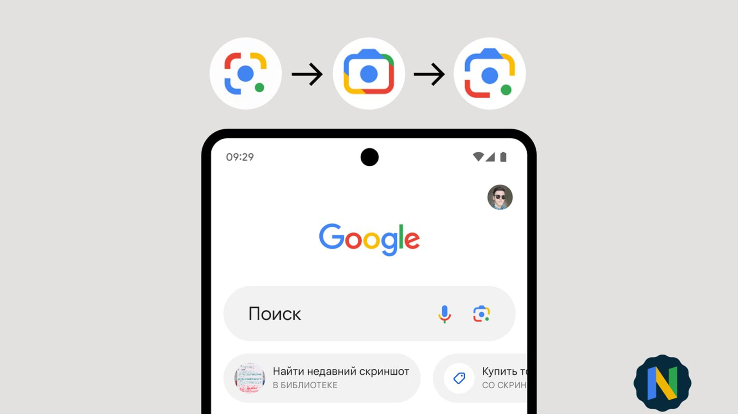
Google Lens is getting a new logo that combines elements from its previous designs.
The technology that’s allowed users to ‘search what they see’ has had a few different sketches act as its logo in the past, with the earliest being a rounded-off circle and, more recently, a camera-shaped icon. Now, as told on Twitter by the Google News Telegram group moderator @Nail_Sadykov, another logo that blends the two designs will take over.
Google updates the Lens icon.
The updated icon first appeared in Chrome Canary a couple of weeks ago. Now it has also appeared in the Google app (14.17.16.29 beta)
I hope they also update it elsewhere (Camera, separate Lens shortcut, and Pixel Launcher) to make it consistent pic.twitter.com/QCNBWXl7LG
— Наиль Садыков (@Nail_Sadykov) April 25, 2023
The icon also brings back the green circle in the bottom corner of the logo, which was featured in both the 2019 logo and the original.
It appears the new, modernized logo was first seen in Chrome Canary v114, a software that’s historically acted as a testing ground for the company’s visual updates. Despite the new logo not showing up in places like the Pixel Launcher, the Lens listing on the Play Store, and Chrome’s new tab pages, it is visible with ‘v14.17.16’ of Google Search on Android.
The new logo will look to keep enough familiarity to be easily recognizable but provides enough of a change to be aesthetically noticeable.
Source: @Nail_Sadykov Via: Android Police
MobileSyrup may earn a commission from purchases made via our links, which helps fund the journalism we provide free on our website. These links do not influence our editorial content. Support us here.


