Google Meet’s May update offers a revamped desktop/laptop experience, including enhancements to video feeds, watching and presenting experience, and the bottom bar has started rolling out for “Rapid Release” (users under rapid release get updates as soon as they’re released) domains.
Learn more about the changes brought about below:
Controls
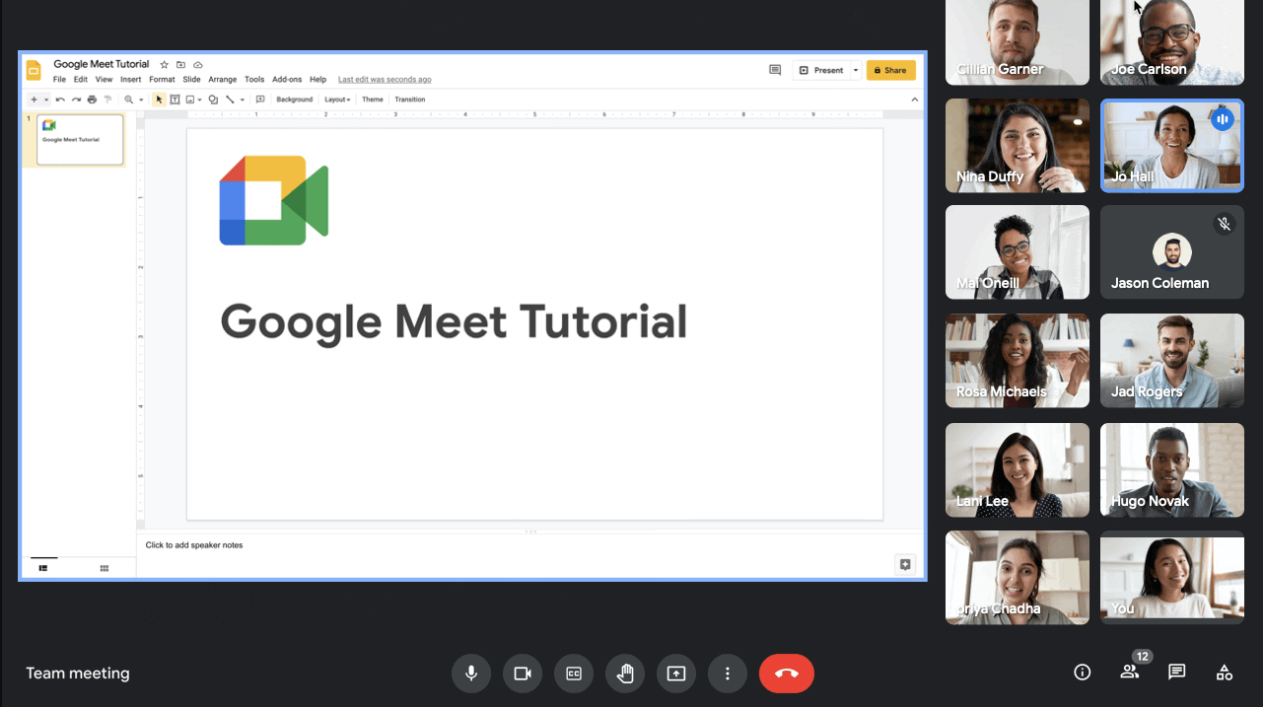
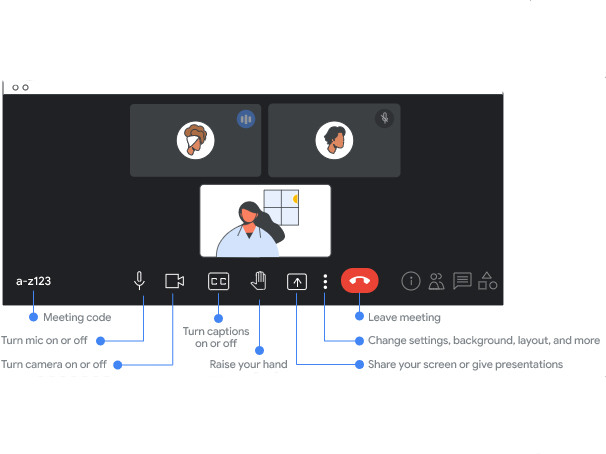
The new design incorporates important controls into an updated bottom bar that is always visible, allowing you to check the status of your mic and camera. To minimize ‘accidental touches,’ certain buttons have been rearranged, including the ‘leave call’ button, which has been moved further away from the camera and microphone buttons.
Additionally, to provide users with extra vertical space, the list of participants, chats, attachments, breakout rooms, polls, Q&A and sharing buttons have been moved to the bottom-right corner. The new design caters to larger meetings by allowing more participants to be seen at once.
Presenting
From now on, when you share your screen in a meeting, you’ll be able to view other participants as well as what you’re sharing. This can be done by unpin-ing your presentation so that it can be viewed as a tile.
This will be extremely helpful in scenarios where you’re presenting something, and you need to assess the audience’s reaction to it. Scenarios being: School/college online classes, business meetings or maybe a job interview.
Learn more about presenting your screen on Google Meet here.
Self View
May’s Google Meet update gives users the ability to change their camera feed from a tile embedded in the grid of all participants to a floating image that can be resized, repositioned, or hidden.
By default, your feed will appear as a floating overlay in meetings with two participants. For meetings with three or more participants, your self-view will be positioned in the participant’s grid by default and can be moved around as per your choice. Google Meet registers these subtle changes to position your self-view where you want it to be in future meetings.
Learn more about self-view in Google Meet here.
Participant tiles
Re-designed participant tiles are here to reduce visual noise and participant-cluttering, improve interaction, and put more people at eye level when you look into your camera.
When a participant speaks, their tile is highlighted in blue, along with a ‘speaker’ indication that displays on the top-right corner of the tile. Similarly, when someone is muted, a mute-indicating icon appears on the top-right corner of that participant’s tile.
Click here to learn more about participant tile layout.
These changes began rolling out for ‘Rapid Release’ domains on May 24th and will continue for the coming 15 days.
For ‘Schedule Release’ domains, the update will gradually start to roll out beginning June 1st.
Additionally, Google states that users that have updated to the newer build can revert to the ‘legacy’ experience until June 10th, after which the new Google Meet look will become the default one.
Image credit: Google
Source: Google
MobileSyrup may earn a commission from purchases made via our links, which helps fund the journalism we provide free on our website. These links do not influence our editorial content. Support us here.
