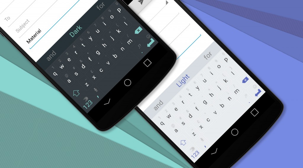
One of Google’s goals with Material Design is to make Android apps more uniform in appearance. The design language makes use of bright colours, shadows, animations, grid layouts and card-like visuals to better communicate the ways in which users can interact with content.
Material Design updates have been rolled out across of most of Google’s own applications and now the company is hoping to make it as easy as possible for third-party app developers to fall in line and replicate the same experience in their own applications.
Google’s developer site now hosts a checklist for developers building apps with this new design language. The company is encouraging developers to use the list to mark their progress as they implement elements of this new design language into their apps. It’s important to note that developers don’t necessarily have to include everything from the check list. Google notes that any developer that includes “a good chunk of the items” in the checklist and follows the traditional best practices for Android design, will be “well on their way.”
Despite the above, Google places special emphasis on signature elements when it comes to what should be incorporated into apps. These include shadows to show which surfaces are in front of others, a contrasting accent colour, a coloured status bar that matches either the primary app colour or the app’s content, icons that follow the system icon guide lines and the standard Material Design icon set, the circular reveal animation, and tabs that follow the Material Design interactions and styling with no vertical separators.
Check out the full Android Material Design developer checklist.
[source]Google[/source]
