Google is updating the Google Play Store logo, and the changes are so minuscule that you might even have missed it.
First spotted by 9to5Google, the new Play Store logo has more rounded corners, and the blue and green colours in the logo appear to be darker. The red and yellow shades also appear darker, though the difference is negligible.
-

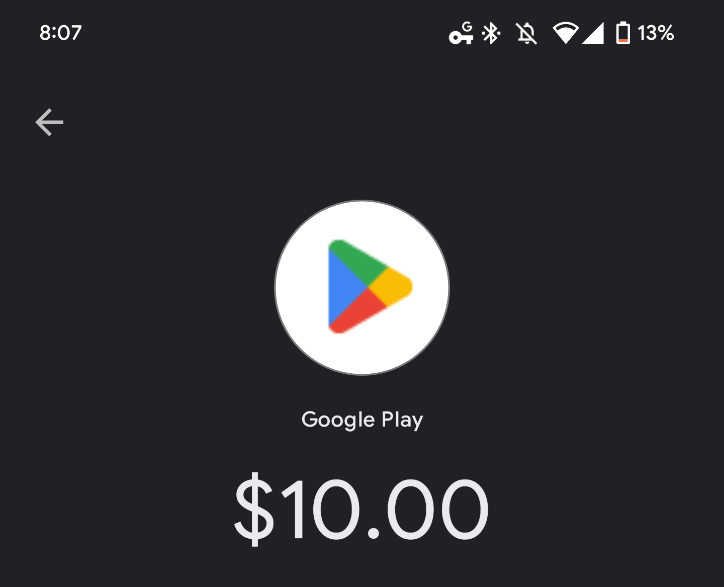
- Current logo
-
- New logo
-
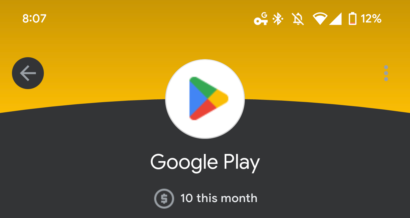
- New logo
The last time Google redesigned the Play Store logo was back in 2016, when the Mountain View, California-based company added brighter shades to all the colours in the logo. The current change seems to be reversing the decision taken back in 2016.
The new logo isn’t out everywhere yet. According to 9to5Google, it only appears when you make a Play Store transaction with GPay or Google Pay, with the new logo popping up as a low-resolution icon on top of the transaction details as the merchant icon.
It’s currently unclear when Google revamped the logo, and when it will officially deploy the new logo all over the Play Store.
Image credit: 9to5Google
Source: 9to5Google