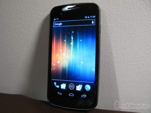
Good things come to those who wait, and we’ve been waiting a very long time.
The Galaxy Nexus is not only the most anticipated Android device of 2011, but perhaps the most desired smartphone of any kind this year. Google and Samsung have created a blank slate on which to showcase Android 4.0 Ice Cream Sandwich — a form-fitting, high-resolution dual-core powerhouse blank slate, mind you — and care shows in every pore. The interface has been completely overhauled, hardware-accelerated and beautified. This is the first Android version we can confidently say is pretty.
Like the Nexus S before it, the Galaxy Nexus is not the most powerful device on the market, but it doesn’t matter. From our time with the device, we can safely say there is no going back. Every piece of Android hardware from this day on will be judged not on the speed of its processor or its pixel density but on whether it is running Ice Cream Sandwich. The Galaxy Nexus has a market lead so vast as to be a chasm; the experience is just that much better. While there are minor aspects of the hardware we’d love to see improved, Samsung has wisely taken the best design aspects of the Nexus S and Galaxy S II variants and created the first best Android device ever.
Specs:
– Android 4.0 Ice Cream Sandwich
– 4.65″ 720×1280 pixel Super AMOLED display
– 1GB RAM, 16GB internal storage (no microSD slot)
– 5MP camera back camera / 1.3MP front camera
– 1080p video capture
– WiFi (b/g/n), Bluetooth 3.0, A-GPS, NFC
– 1750mAh battery
– 135.5 x 67.9 x 8.9 mm
– 135g
– HSDPA 21Mbps HSUPA 5.76Mbps (850 / 900 / 1700 / 1900 / 2100)
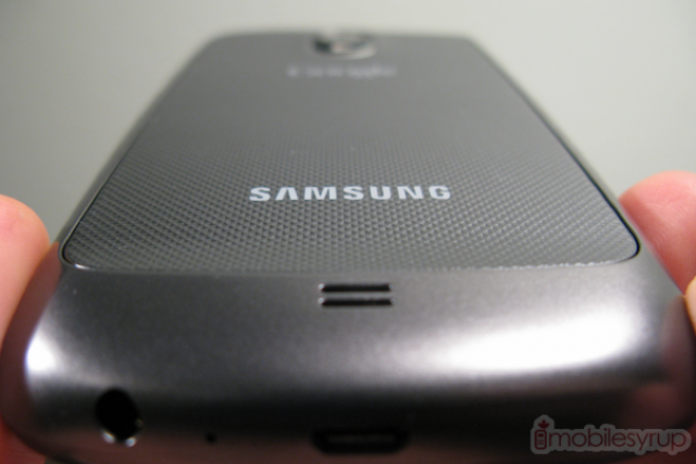
There is something immediately friendly about the Galaxy Nexus, as if you’ve seen it somewhere before. In spite of its curved silhouette, the design owes a lot to two previous Samsung devices: the Nexus S and, more effusively, the Galaxy S II. It retains the slight bottom hump, though less marked, and the pitch-black Super AMOLED display. The front is remarkable in its austerity; there are no capacitive touch buttons to interrupt the bezel and its symmetry. It’s as if you’re staring into a black hole.
Turn the device onto either side and you’ll a brushed metallic plastic rim, sturdily made as ever, but not rugged. At only 135g it feels extremely light due to even weight distribution, but it’s missing the satisfying heft of the iPhone 4S or HTC Amaze. It does, however, help the device disappear in the hand and lends it that blank slate effect Google is aspiring to.
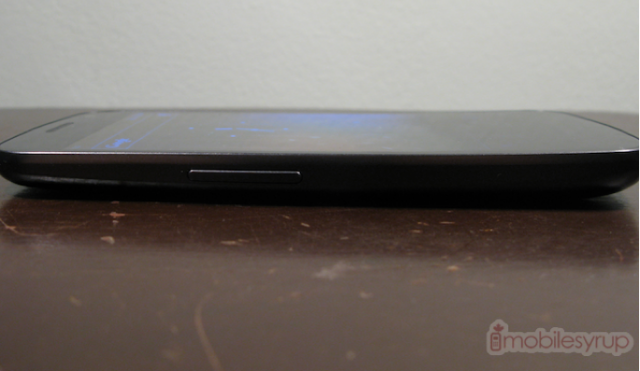
Like all Samsung devices, the volume rocker is on the left and the power button on the right; the plastic buttons do a fine job and feel sturdy and strong. The bottom chin houses the microUSB port and headphone jack, an odd placement to be sure but likely necessitated by the 8.94mm thin top portion. We’ve actually come to prefer a bottom headphone placement, as it’s easier to jump right into using the device when taking it out of a pocket or bag, top down.
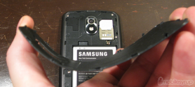
The battery portion almost exactly emulates the Galaxy S II 9100 with its textured plastic tab design. Samsung has wisely used a flexible matte plastic that bends easily but does not break. Underneath the housing is a 1750mAh battery, SIM card slot and, alas, no microSD slot.
The Galaxy Nexus takes on a teardrop design, elongated and stretched over the dimensions of the Nexus S but clearly its kin. It is a pleasure to hold, and despite a 4.65″ screen size, pocketable and comfortable. The curved glass is even more pronounced than its predecessor, and aides in visual acuity and overall touch accuracy. There is a white pulse light below the screen, reminding you of forgotten emails or unseen texts.
The Display
Stop worrying about PenTile.
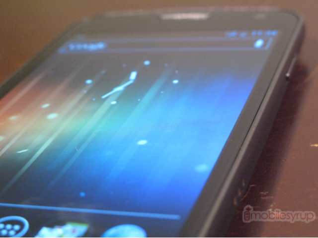
The Galaxy Nexus has one of the most stunning screens we’ve ever seen. The pixels are so small as to be microscopic, and unless you utilize one you’re not going to see a PenTile grid. What you will see is sharp text, incredible viewing angles, perfect blacks and outstanding clarity. If this is the future of mobile displays we can only say, “It’s about time.”
Let’s start with colours. Reds, greens and blues are accurate; this isn’t your mother’s oversaturated Super AMOLED display. Either Google has done something with the colour temperature or Samsung has finely calibrated its parts but for the first time we can say that colour accuracy is equal to a Super LCD display. At full brightness whites are evenly toned, though they take on a slight yellow tinge at half brightness. Blacks stay true throughout owing to the AMOLED technology, and viewing angles are 180 degrees in all directions.
In sunlight the Galaxy Nexus fares pretty well, though most of the detail gets washed out. We wouldn’t recommend reading Anna Karenina on a hot June day, but it does about as well as other AMOLED displays, which unfortunately is less so than most LCDs. Maximum brightness is phenomenal, though we don’t have the correct equipment to measure it.
The most significant improvement over previous Super AMOLED displays is in the clarity of text. Reading an article or a desktop-formatted web page is not only attainable but enjoyable. With Android 4.0’s new Roboto font much of the interface is a pleasure to read, and it’s nice seeing Google taking an interest in typographic fundamentals.
Performance
Our full benchmark results will be in our Software Overview, but from hours of subjective usage there is no need to worry about occasional stuttering and slowdown. We are using the production build (ITL41D) and the operating system took everything we threw at it and then some.
The dual-core TI OMAP 4460 SoC runs at 1.2Ghz, 300Mhz lower than the chip is traditionally clocked at, but it seems like Google has taken a page from iOS and is finally utilizing hardware acceleration throughout the UI. Unlike a custom skin which has taxing animations and garish flourishes, ICS pares down excess, exciting us with mature design decisions. Press down on the new software home button and a blue glow emanates from where your skin touched the display. It’s organic and friendly. Meander through your list of apps and the new page pops up like an old friend. We have noticed no slowdown or app instability.
Before we received the device, what troubled us was the idea of a last-generation GPU pushing 1280×720 pixels of the Galaxy Nexus’ screen — we can now say that fear is unfounded. We picked up and played a few games of Wind-up Knight and found it performed better in its native resolution than did the Motorola RAZR at 960×540. The RAZR uses the same GPU at a slightly slower speed, but has 40% fewer pixels. Google has done some serious tweaking to the graphics drivers to achieve such amazing results.
Battery Life
So far, so good. While we’ve only had the device with official software for a day, the Galaxy Nexus has held up remarkably well. It doesn’t hurt that the majority of Ice Cream Sandwich is dark, which means fewer pixels are actually turned on at any time, but Google and Samsung were wise to choose the TI OMAP 4460 chipset for the job; it has proven to be one of the most power-efficient on the market.
We will do a complete battery run-down test in a future post.
Connectivity
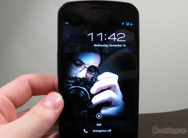
Unlike the Nexus S which was released in multiple versions, the Galaxy Nexus has a 21Mbps pentaband UMTS radio inside. This means that out of the box it is 4G-compatible with every major carrier in Canada, including the new entrants. And, yes, the phone is unlocked by default so carrier portability shouldn’t be an issue.
We had great results making phone calls and downloading files using Bell’s HSPA+ network. While some users may be upset at lack of LTE support, the nascent technology is still too battery-hungry for long-term usage and most Canadians still don’t have access to it. Instead Google and Samsung Canada made the right decision to launch the HSPA+ model, on which we found download speeds consistently exceeded 5Mbps. Ping times were usually under 100ms, though occasionally they jumped over 150ms.
Call quality through the earpiece and speaker left us impressed: our recipients heard us loudly and clearly even while walking outside on a blustery fall day. Similarly the mono speaker on the back delivered loud, punchy audio in line with most of its Samsung kin.
A quick word on GPS: we used the free turn-by-turn navigation for over an hour with no signal jumps or losses. We obtained a signal in around eight seconds, and it never wavered.
What’s Next
In the coming days we will do a full in-depth review of the Android 4.0 software and its myriad improvements. Our initial impressions are good: this is the first time Android is visually contiguous throughout the OS, consistently fast and stable. Existing apps that haven’t been explicitly updated for ICS will see performance improvements and design changes; the menu is now at the top of the screen, dubbed the Action Bar.
The 5MP camera seems to take fantastic shots, and the speed at which they are taken is remarkable. It has been explained to us that Google and Samsung didn’t want to sacrifice shutter speed in place of a more capacious sensor, but five million pixels should suffice for most point-and-shooters. We’re going to take a look at the camera and video quality, and the new panorama mode.
From what little we’ve used of it, the keyboard has graciously been overhauled for the better. We really disliked the Gingerbread keyboard and so far have found this one not only extremely responsive but accurate and smart. Google has also revamped the copy-paste menu, so it’s no longer hold down-tap-hold down to perform a simple function.
—
We understand how excited you are to get a glimpse of the Galaxy Nexus and Ice Cream Sandwich and we look forward to taking you on that journey with us. There is lots more to come in the next few days, so stay tuned.
MobileSyrup may earn a commission from purchases made via our links, which helps fund the journalism we provide free on our website. These links do not influence our editorial content. Support us here.


