The Play Store on Android has been one of the final holdouts to get Google’s modern Material Design, but a recent code teardown suggests that an update is coming very soon.
Google has been updating all of its apps and services since last year starting with the web version of Gmail. Since then, Google’s given facelifts to massive apps like Maps, Drive and pretty much every other popular first-party app. YouTube and YouTube Music are the last big apps that haven’t, or might not, receive the modern look.

In terms of the Play Store update, Google has wiped almost all of the colour from the app in favour of its new all-white design. There are hints of the colours you’ve grown to expect, but they’re used very sparingly in this update. The colours still represent the different stores within the app – blue for books, green for apps and games, burgundy for movies and TV.
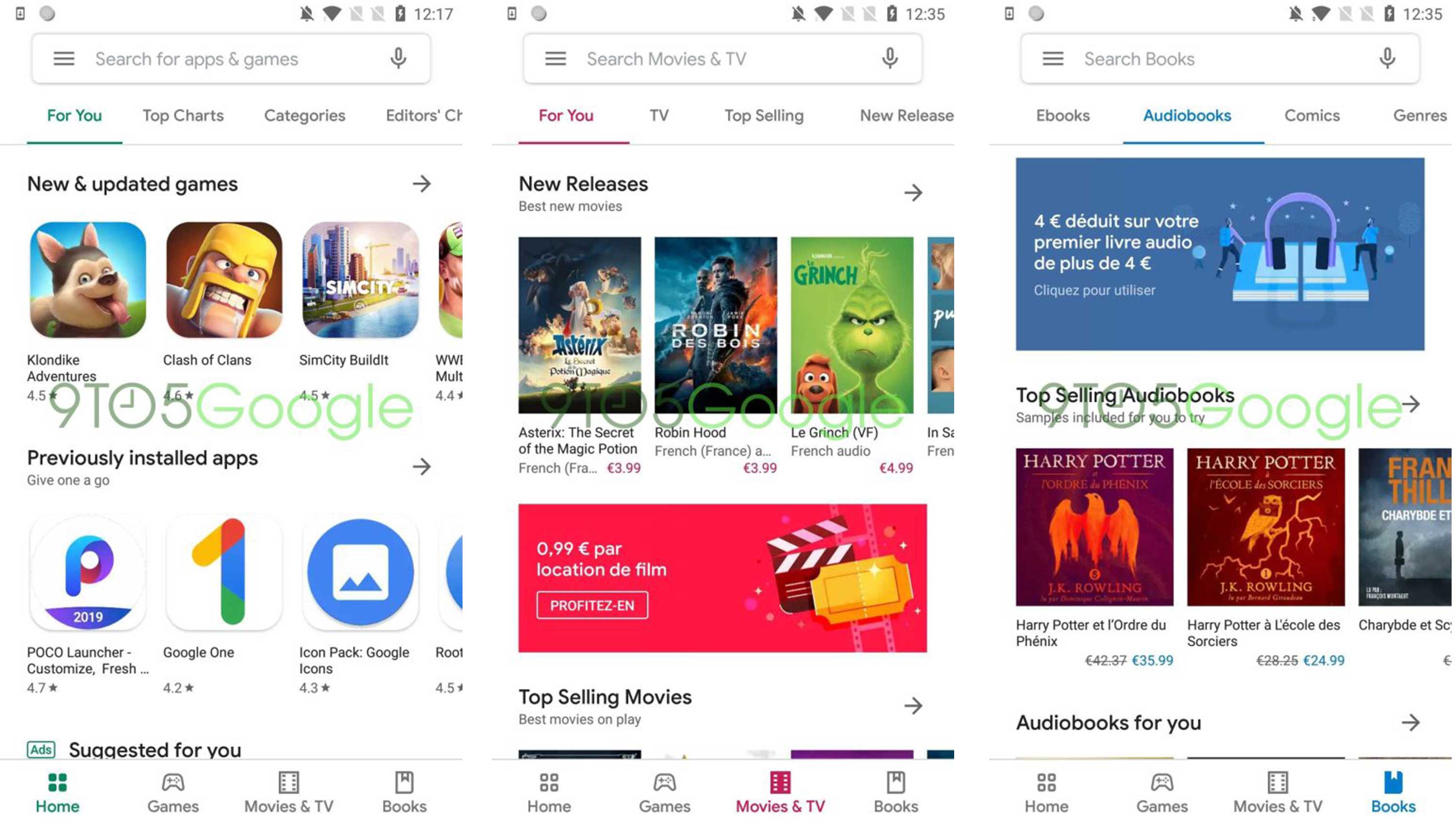
One of the nice quality of life improvements is the fact that Google’s moved the store navigation bar from near the top of the app to the bottom. This should make it a bit easier to move between the different stores within the app. In spite of this the Search giant is still keeping the ‘For You,’ ‘top Charts,’ ‘Catagories,’ ‘Editors’ Choice’ and other subsection tabs along the top of the app’s main pages.
Notably, the company has dropped the icons for the subsections above in favour of clean text but added new Material Design themed icons to the new bottom nav bar.
One of the biggest changes is that it looks like Google has removed the music section from within the app.
Throughout the whole redesign, the app is using Google Sans which helps bring the app in line with the company’s other first-party apps.
Google even restructured the app page with a fresh look that makes it look a lot cleaner compared to its current iteration. 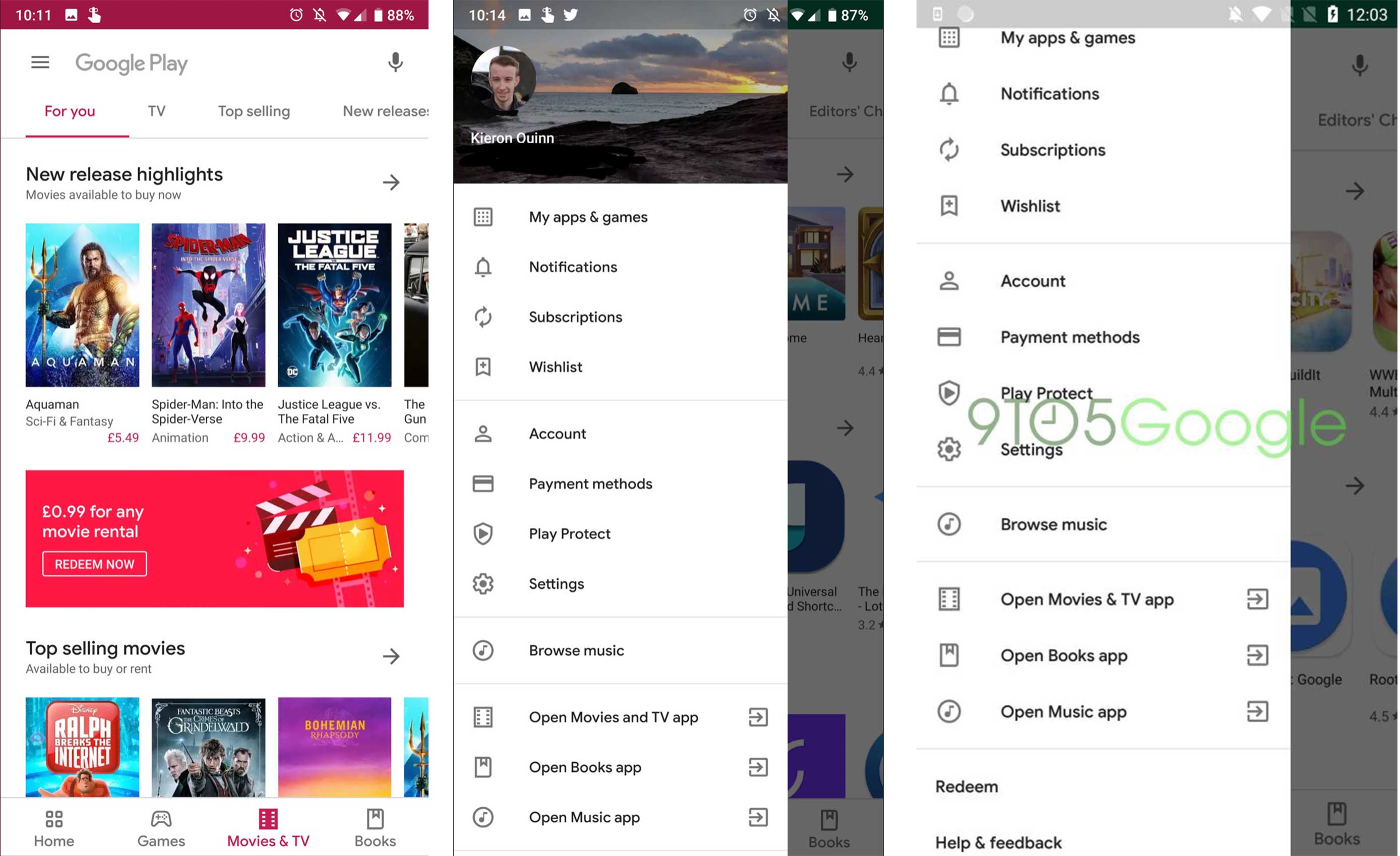
Since this app update isn’t live yet this makes some sense, but it’s worth point out that the screenshots used in both 9to5Google’s and Android Police’s articles show two slightly different versions of the new store. In particular, there’s a coloured status bar in one image, and the search bar looks different too. My heart tells me that the 9to5Google pictures are more accurate since they have more changes that bring them in line with Google’s other updated apps.
Image Source: Android Police, 9to5Google
Source: Android Police, 9to5Google