French developers and publishers Ubisoft have unveiled its new logo. The blue spiral logo that many of us have come to known as the logo for hit games such as Assassin’s Creed, Far Cry and Watch Dogs has changed to a minimalist logo.
Introducing the new Ubisoft Swirl 🎉
Check out the evolution of our logo over the last 30 years >> https://t.co/Unu4yxfAqZ || pic.twitter.com/Vw0cZWfUyb
— Ubisoft (@Ubisoft) May 31, 2017
According to Ubisoft, which has many of its offices in Canada, the change of logo marks a new era for the company. This era will have an increased focus on live and digital games, with a more player-centric approach to creating immersive worlds.
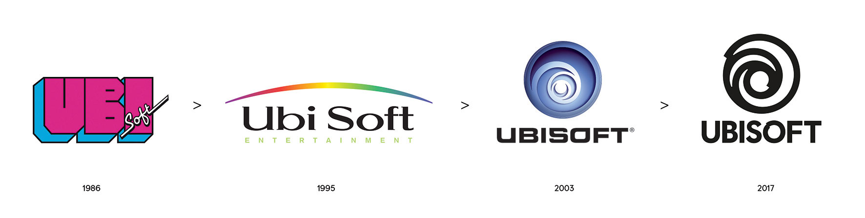
The Ubisoft logo has changed three times since the company’s inception in 1986. The initial company was focused on Ubisoft’s game distribution business, followed by its entry into game creation in 1995 with Rayman. In 2003 it became the blue swirl we’re used to, after its acquisition of Red Storm and the Tom Clancy video games.
The French company says now that it creates video games, comic books, movies, books and TV shows, it’s time for a change once again. Today, Ubisoft’s logo is now “minimalist, modern and monochromatic.” The new logo is deliberately an O with a swirl is supposed to represent the company’s ‘human qualities’ of enthusiasm, curiousity and a ‘touch of madness.’
“With this new look, we proudly embrace our role as a creator of worlds and invite you, the players, to continue playing, engaging, and growing with us. As we move towards our most exciting time of the year (E3!), you will see this new emblem take on the colors and textures of our worlds, and we can’t wait to hear what you all think,” says Ubisoft.
Source: Ubisoft