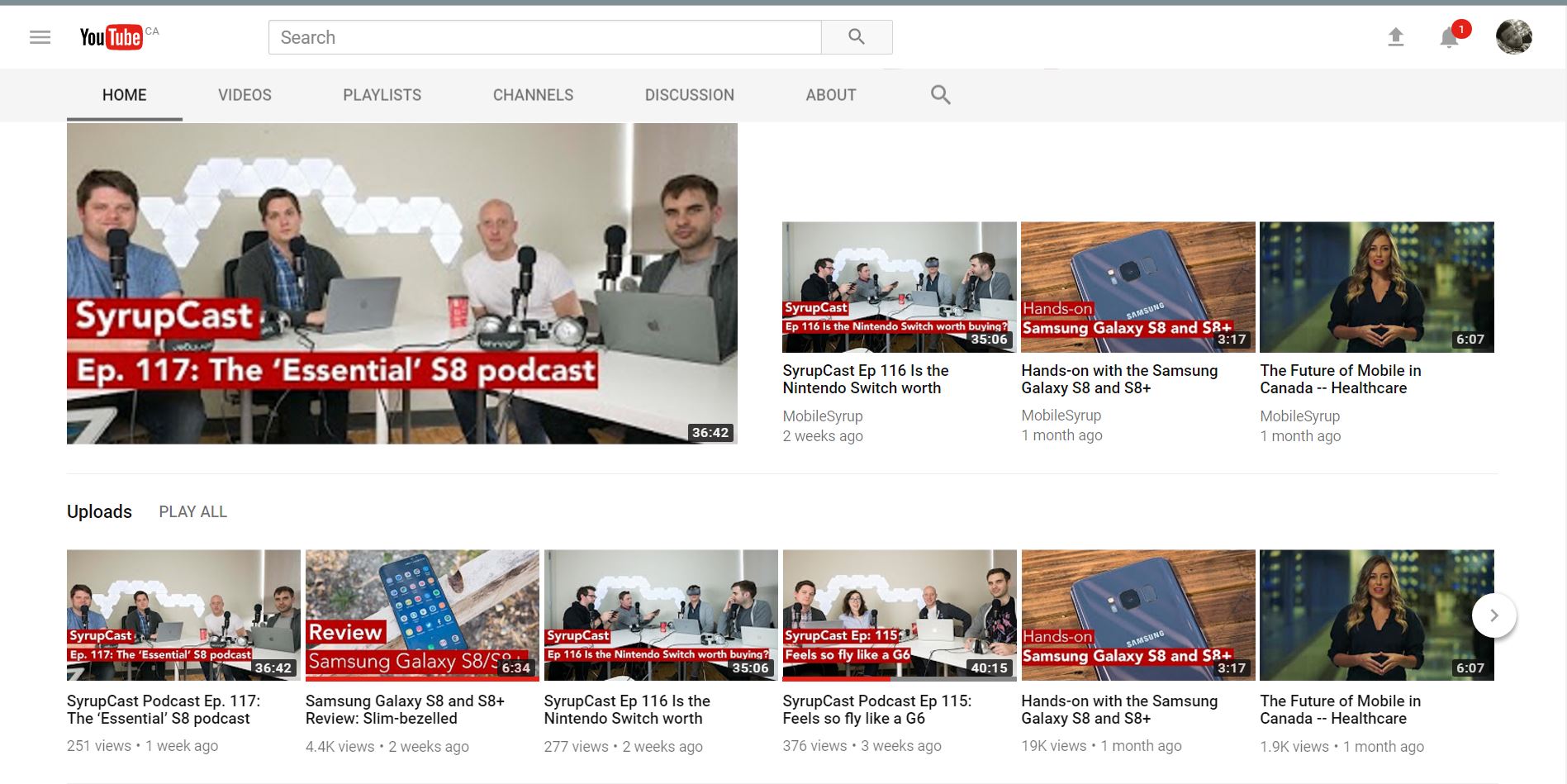
YouTube has a new minimalist design that simplifies its iconic look.
The website’s new look calls upon a lot of the design principles that have defined Google’s Material Design aesthetic. According to Mashable, YouTube users first discovered the new design more than a year ago, but now everyone can check it out.
The flat appearance gets rid of most of the previous design’s colours as well as blue headlines, replacing them with black. Additionally, the design makes the arrow at the sides of the website pop out as if they’re imprisoned in a bubble. The YouTube logo and search bar are smaller than before as well.
“We don’t want the UI to distract, it should always be about the content,” said Fred Gilbert, head of user experience at YouTube, in an interview with Mashable.
Furthermore, it’s easier to enable the website’s dark theme setting while using the new design. Users on Chrome can go to their profile, underneath which they’ll see a toggle to enable the setting. Like with most other dark themes, the website is easier on the eyes when the setting is enabled.
That said, the new design isn’t perfect. At least initially, I’m finding it difficult to find YouTube’s Creator Studio; it disappears at times within the profile menu. Clicking on the menu a couple of time usually brings it back. However, as the design is only in beta, it’s understandable that not everything works perfectly. Moreover, it’s possible to opt out of the new design at any time.
The beta shouldn’t feel like too much of a difference however once you have it you probably won’t want to change back.
Source: Mashable


